Drawing August Theme: Camping Postcard & Pin {Process Post}
 Hello, something a little different this time. I want to walk you through my thought progress of the camping theme! Camping is something I did as a child every summer with my family because it was affordable and it also include one of my family's favorite hobby, fishing (not included this time LOL. I watched the Yuru Camp and loved it a lot, this theme took inspiration from both sides. The food is from the anime, the memory of the pine forest is from my childhood.
 Originally this concept postcard was majority going to feature the night sky. It was planning to be tonally black trees with a glossy emboss finish of glow in the dark stars (unfortunately I was not able to source any type of glow in the dark material, which you will see me talk about in my October theme in the future *cries*) I also decided to scrap this idea as a postcard and use it for a sticker because as a postcard, the character will be too small and will print too small.
The second sketch focused on the character more. This time I took inspiration from campground maps and icons. When I sketch backgrounds sometimes, I will just pull some inspirational idea and will go, "something like trees and mountains will go to the back, I will deal with it later" LOL So in this case, I made a super messy drawing and just focused on finishing the character first. I emphasized that she need some fun camping patches (it is something that I put as a MUST need in the initial concept.
Something sad I never got to do was to make camping patches!! I did the sketches for them too but after the dual pin of Alice and the transparent PVC postcard of Apothecary, I just couldn't fit it in my budget. ; - ; Sometimes I have to rein in a lot of the creative things I want to do for each month to keep on track.  After finishing the drawing, I was stick for a while between two color schemes. The orange scheme matches the character outfit but the green scheme feels more foresty. I thought they both look good. When I get stuck like this, I will close and reopen each image option and look at it with fresh eyes. So I decided the next day. Upon waking up, I noticed that the green one provides better contrast to the character. When I squint my eyes and look at the orange piece, its hard to tell where the character is. So that is how green was the final printed version.
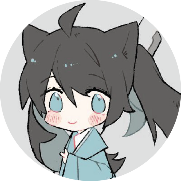
This is a rare occurrence but I actually did two pin designs for this concept. Initially, I did her side view design. For this design, it really feels like she is exploring a forest while sipping on coffee. I made sure to show her backpack to see all the stuff she is carrying. For sure she looks like a camper! After turning her design into a pin, I noticed that there are way too many colors going on and it will be difficult to produce as three of the colors are screen printing. It became rather complicated and also she lost her cute starry eyes.
So I redid the design. Camping really does feel different when it is the day or the night. I think that with her starry eyes and the fire hairclip, it also makes more sense to make the pin a bit more of a night sky look! This is definitely a lot of colors type of pin but each color was chosen carefully to make sure it looks simple but not complicated. Hence the final result.
I hope you like this slightly different approach to me sharing my progress on camping! The pin pledge ends on August 31. I cannot wait to ship this out to you! P.S. I forgot to talk about her pet corgi! She is a Welsh Corgi and I really love corgis with tails! I just want to give her a camping companion since solo camping can be a little lonely. ; w; /